How do seasonal price oscillations arise?
When looking at the price trends on the futures markets over a longer period, it is noticeable that certain patterns are repeated at regular intervals.
Commodity markets are range-bound markets. Over a long period of time, the prices fluctuate between upper and lower limit. This results in seasonal patterns that represent a predictable price change. They are repeated every day, every week, every month or even every year in comparable, equal periods.
The following charts illustrate this:
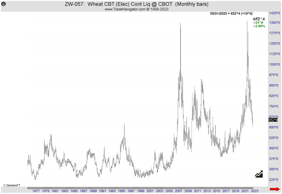
Fig.1: Live Cattle – Cash market 1975-2011
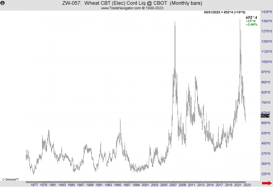
Fig. 2: Hard-Red-Wheat – Cash market 1972-2020
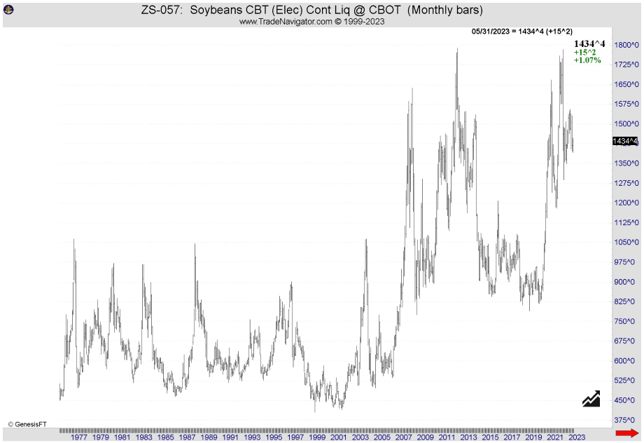
Fig. 3 Soybeans – Cash market 1972-2020
These seasonal cycles show certain trends in price developments. Of course, they cannot be viewed alone. It should be carefully analyzed which events, e.g. 2007, caused the wheat price to explode (Fig. 2). However, they offer a useful tool to predict future trends and price developments.
But how can the origin of these cycles be explained?
Other factors for seasonal price fluctuations
But what does it look like in other markets? The demand for bonds? The supply on treasury bonds? Supply and demand are not always responsible for seasonal price cycles.
Investment funds do their best to perform well over the year, driving share prices. Dividends at the turn of the year, whose interest income from bonds also flows into the stock market, also affect prices. Or the so-called “holiday effect”: at certain times of the year, investment decisions are made more freely and easily and the market is affected by it. A good example is the much noticed “Year-end rally”.
But there are other days when recurring seasonal rate changes occur. In futures trading, this includes special US holidays or days of regular publication of important economic figures or stock market reports. You can find an overview of the most important events and holidays at the end of the article.
Ultimately, a seasonal trend, like any price trend, is the result of tens of thousands of individual buying and selling decisions. And there is another reason for that: Changes in certain circumstances, such as technical innovations in the agricultural sector, can lead to changes in the seasonal price, just as changes in consumer preferences or in fashion / nutrition / behavioral trends.
Seasonal patterns and representations
When analyzing seasonal price trends, a top-down approach is the best to be applied. In other words, let’s first consider a couple of questions: Which market situations exist in which months of the year? Are May and October particularly bullish markets, is August rather bearish?
This information is the more meaningful the longer the periods over which it is collected are. Some particular years may have to be subjected to special consideration, as unusual incidents (natural disasters, corona viruses) would alter the statistics. If there is an extreme course in a year, this individual event naturally influences the seasonal trend significantly more than in a “normal” year.
Seasonal charts – first look: the annual chart
It is better to get acquainted with seasonality via annual seasonal charts. Here, as already mentioned, the trend is determined over a certain period of time. We at InsiderWeek use three time frames and consider the periods of 5, 10 and 15 years.
Trends that show identical patterns in all three time frames are of particular interest. There are obviously reliable seasonal trends here.
Fig. 4 below shows the seasonal trend of gold. Two clear dates for a price increase can be seen here: at the beginning of the year and from the middle of the year until autumn. Apparently, the jewelry industry is preparing for two most important gift dates – Easter and Christmas. (Of course, this rationale is somewhat simplified, but since it is not only the Christian culture that celebrates two main festivals at this time, this can be considered a perfectly acceptable explanation.)
Fig. 4: Gold — Seasonal Chart
One more aspect becomes clear when looking at the seasonal annual charts. Which one? Let’s look at these two charts:
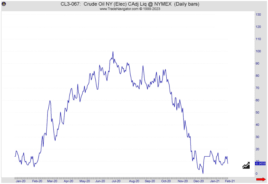
Fig. 5: Crude Oil – Seasonal Chart
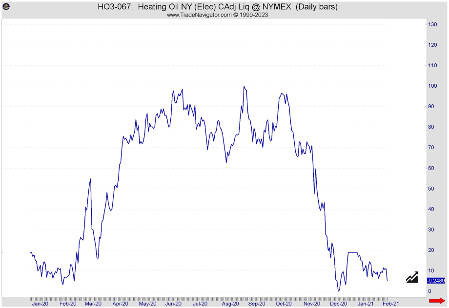
Fig. 6: Heating Oil — Seasonal Chart
No, we haven’t used the same chart twice here! Fig. 5 shows the price history of crude oil, Fig. 6 that of heating oil. What is the first thing you notice?
First of all, it is clear that both price trends are identical. Crude oil is the basic material for heating oil, if the price of crude oil rises, heating oil becomes more expensive. Of course, this is not world-shattering new information, but it has an impact on our trading: We take correlations like these into account when planning.
This enables a diversification of the portfolio and it gets possible to switch to a correlating cheaper one when there is a COT signal in a “more expensive” market. The prices of these markets run parallel, which is immediately visible on the seasonal charts.
You can also see the influence of seasonal demand on price development, which we mentioned earlier.
Would you like another example of this type?
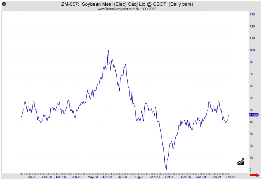
Fig. 7: Soybeans — Seasonal Chart
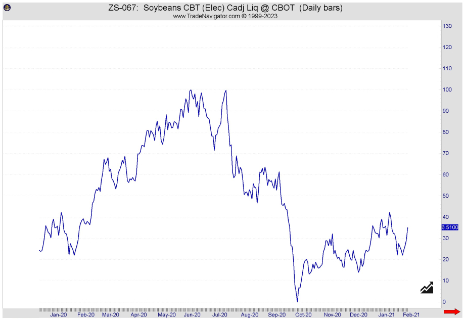
Fig. 8: Soybean Meal — Seasonal Chart
Here too (Fig. 7 Soybeans; Fig. 8 Soybean Meal) it is clearly seen: correlating markets show their interdependency much more clearly in their seasonal trends than in the current price charts. Soybean meal is produced from soybeans, soybean prices rise, and, consequently, meal becomes more expensive too; if more flour is requested, this demand is also reflected on beans.
The next level: monthly and weekly average results
In the next step we look at trading months and trading weeks respectively. To do this, we don’t just analyze the weekly charts, but go into test mode.
We check the markets in historical tests, e.g. we go on the weekly basis on Monday to the market opening and close the position at the end of trading on Friday. The whole thing is then statistically evaluated over different time frames. This results in evaluations of average monthly returns and average weekly returns respectively.
Note: the following charts were created with our new Tool Quantum (available to our paid subscribers). The tool is still in the beta phase, please experiment with it and let us know if you find any errors! Thanks for your help.
An example of this: The Corn futures in its best or worst trading months …
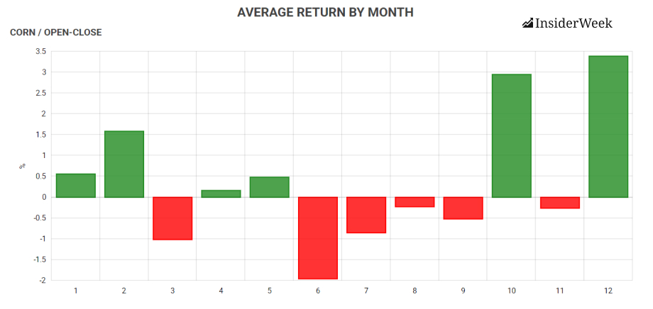
Fig. 9: Corn futures – Average monthly return
… and trading weeks, statistically evaluated over 15 years:
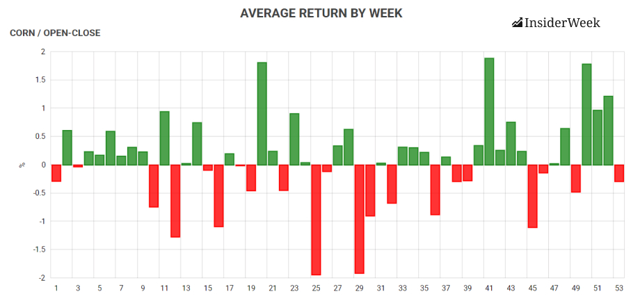
Fig. 10: Corn futures – Average weekly return
The next level down: the best trading days of the month
Another statistical evaluation, which we also incorporate into our trading planning at InsiderWeek, is the average return on a daily basis, also called “Trading Day of the Month”. The principle here is the same: we go into position to open the market, close this position at the end of trading on the same day. Let’s look at the results for Corn in May:
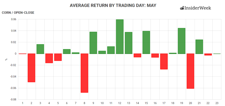
Fig. 11: Corn futures – Average daily return
IMPORTANT: These days are TRADE DAYS, not calendar days. In May 2020, May 1st is also the first trading day, but the fourth trading day is May 6th! Weekends – or stock exchange holidays – are not trading days. A calendar month therefore has at least 19 (February: 28 days, 8 days of weekends, February 17 is the US holiday) and maximum of 23 trading days.
The next level down: the return based on the days of the week
One last interesting question, especially for short-term traders, is the most promising trading day of the week. Here is the same procedure: in at the opening, out at the end. It turns out that in some markets statistically one day or the other can be devastating for the account!
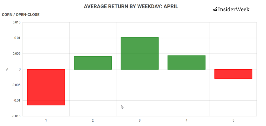
Fig.12: Corn futures – Average return on a weekday basis
But something else is interesting in this context: We have always talked about going into the market at the opening and closing the position at the end of trading. What does it look like if we stay in position overnight and leave the market at the opening on the next trading day?
Analysis of each day of the week when we hold the position overnight:
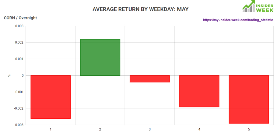
Fig. 13: Corn futures – Average overnight return
How do we trade seasonal items?
How do we use the knowledge of seasonal factors for our own trading?
As it was mentioned earlier, a trading system based only on statistical data is most likely to fail. Although certain patterns repeat themselves over and over again, the stock exchange is not the place Punxsutawney, a town from the film “Groundhog day”, or an endlessly repeating GIF.
However, we like to use seasonal trends and statistical information as confirmation factors.
If there is a long or short signal based on the COT data, it is cross-checked against the statistical data and we also use the available information for an entry timing or determining the exit, for example regarding the Trading Day of the Month (TDOM) or the trading week or trading weekday.
And it is still always important to take the current market situation into account and to critically question the seasonal values. In extremely volatile times, like the recent Corona crisis, statistical analysis should be treated with great caution.
How to follow our trades?
In January 2023, we launched our membership, which allows you to observe how we make trading decisions in real-time.
With our new Pro Trader subscription, you get hands-on experience. We provide transparent insights into our trading activities on both our StartUp and COT-1 accounts, utilizing the COT Report. The trades executed on the StartUp account are ideal for traders with smaller accounts (around $30,000), while the COT-1 account caters to professional traders with larger accounts. All trade entries and exits on these accounts are announced and executed in advance. At the end of each trading week, we evaluate and document all implemented trades in a publicly available trading statistic, ensuring complete transparency.
Click the button below to access more details and join our membership.
Trade with mePlease note that while a subscription offers an inside look into our team's trading practices, you are solely responsible for your portfolio. It's important to be aware that a trade may require multiple entry attempts. It is up to you to manage the risk by using stop losses. We can only share our experience and insights with you.
We wish you profitable trades and the continued development of your trading strategy!